
What is Frutiger Aero?
Share
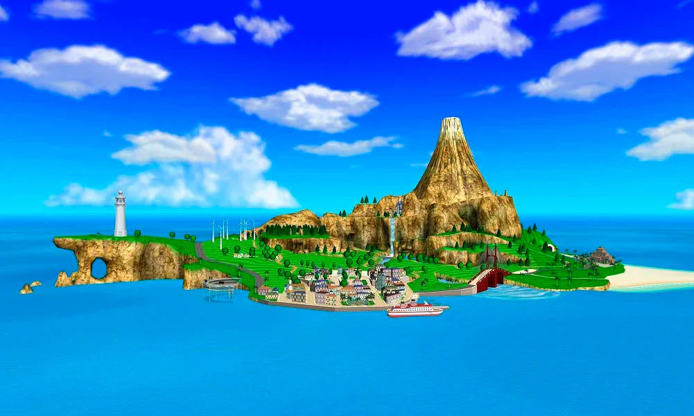
The term Frutiger Aero is one that has exploded in popularity recently, but it’s an aesthetic that is very important to a pretty niche group of people. If you grew up on Wuhu Island and in the Wii Fit Studio, or if you remember the colorful and fun icons and sounds of the early internet, you’ll know what it is.
In its simplest form; Frutiger Aero is an aesthetic that was widely used in the early to mid 2000’s. “Frutiger” comes from the font of the same name, created by Adrian Frutiger. “Aero” refers to the sleek and moving “aerodynamic” feel the aesthetic gives. These concepts brought together create the basis for a huge family of aesthetics that all fall under the banner of Frutiger Aero.
The aesthetic is generally clean, colorful, aquatic, and vibrant. Bubbles, water, sunlight, grass, and fish are commonly used to express a digital optimism, as the early 2000’s brought a mainstream use of the internet and computer technology, this aesthetic was used to familiarize new users with their devices. It was a lot easier to engage with the World Wide Web for the first time when it felt fun, clean, and optimistic.
Starting in the 2010’s, companies took a steep turn towards Minimalism, an aesthetic that is still used widely today. Even outside of the user interfaces of our devices, minimalism is prevalent in all things. While this isn’t necessarily a bad thing, it takes away all of the color and life that Frutiger Aero brought with it. Today, the internet can feel cold and calculated. App icons are simple and clean, but uninspired and frankly boring sometimes.
Frutiger Future seeks to bring back the aesthetic of our online past in the form of clothing and accessories. We haven’t forgotten the vibrant feelings that the past held, and we will continue to bring them into our future.
Our… Frutiger Future. Do you get it?
yikes that’s rough.